Hey Champs 🏆
Let me take you back to when I first dipped my toes into the world of ERG data and dashboards. Actually, let’s be real—I wasn’t even asked to create a dashboard. The request was simply to “get the data,” which was about as vague as it gets. But being the do-the-most person that I am, I knew after I got the data into one place that I couldn’t just leave the data sitting in a Google Sheet. So, I taught myself how to build a proper ERG dashboard.
It took me about two weeks to finish my first one (side note: now it only takes me about two days… or even two to three focused hours if I’m really in the zone 🌱growth 🌱 . I was super proud of that first dashboard. It had total budget spent, the number of attendees at ERG events, number of members - even broken down by department - something that had neven been visualized at the company for the ERG Program. But when I presented it, the feedback I got was ultimately, “This is cool, but we want to see percentages.”
At the time, my dashboard was full of raw numbers. But the executive I spoke to pointed out that while the numbers were nice, they didn’t tell a story. They wanted to know what the data meant in context—what the potential could be versus what it actually was.
Cue my lightbulb moment. 💡 I realized that I needed to think beyond raw numbers, so I went back to the drawing board. After some research and tinkering, I figured out how to build a 100% stacked chart ( examples that I use now are pictured below) to show the percentage of engaged members versus those who weren’t. This was a game-changer. I give a little context on these charts in my Linkedlin post today.
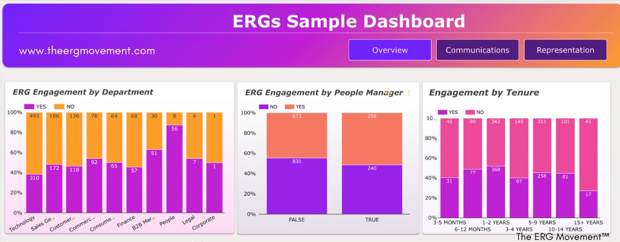
But the journey didn’t stop there. A year into using this new and improved dashboard, and tracking overall growth in “Program Reach” aka participation of employees with the goal successfully hit to move the percentage of employees participating in the ERG from 28% to over 50% over that year (again, I was proud) another executive asked me, “Is that really what we want to measure? It’s cool that we’ve increase the number, but I want to know if these programs are truly impacting the members.”
Cue another facepalm 🤦🏿♀️. I had spent a year measuring the wrong metric. But hey, at least I have the battle stories to share with yall. After a lot of workshopping and feedback, I developed a Member Engagement Score—measuring the percentage of ERG members who are actively engaged in an ERG along with the Channel Engagement Score- measuring the percentage of Communications Channel Members (ex. Slack channels) that have engaged in your ERG Channel over the last 30 days. And, because I love going the extra mile, I even found a way to incorporate goals into the dashboard (example charts pictured below).
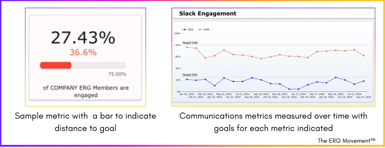
Now, when I present data, it’s not just about where we are now. It’s about how far we’ve come, how we measure up against our goals, what percentage of membership we’re impacting, and the strategies we’re using to close the gap.
That, my friends, is how you tell a story with data.
We’ll dive deeper into this in our session this upcoming Tuesday, but today, I just want to remind you: start with the story you want to tell to avoid some of the headaches that I experienced.
Feeling like you’re running on empty? Need some tips? Hit me up. I’m more than happy to share ideas, best practices, or just chat. I’ve got a ton of ideas, and I’m always looking for someone to share them with. Here’s my link for a quick 15-minute call if you’re interested.
Catch you next week.
-The ERG Homegirl ✌

Resources of the Week:
Two new HIGHLY REQUESTED articles for you all on data:
PS. I’ve FINALLY recorded the video answering all submitted data questions. Subscribe to The ERG Movement on YouTube for the latest when that video drops.

Happening Next Week
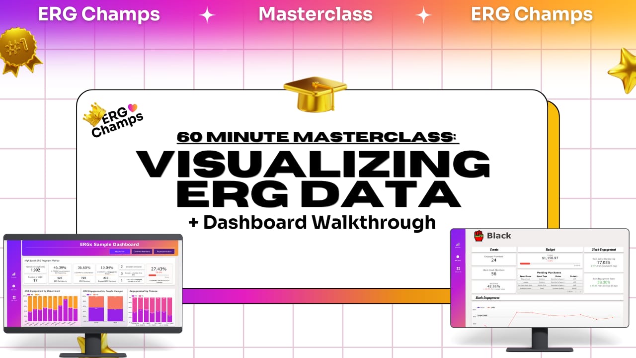
Live walkthrough of the new dashboard that I created for ERGs. Whether you’re a Google Drive or Microsoft company - you can get this exact dashboard with $0 in software costs. :)
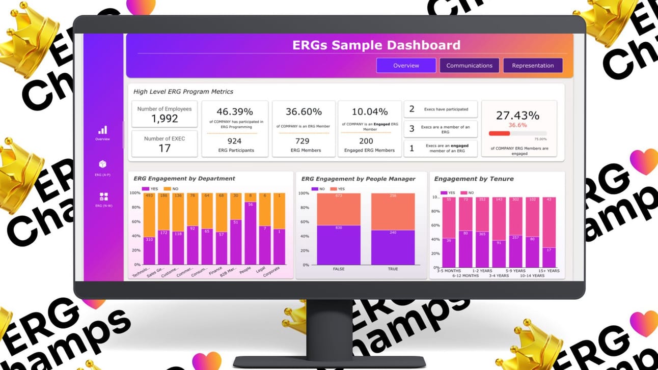
Speaking of visualization, after years of trial and error, I’ve finally finished designing an ERG dashboard that you can have built on free tools Looker Studio (for Google Folks) or PowerBi (for Teams folks).

Summit Season Is Here
Here’s 5️⃣ of the top sessions that I’ve hosted done this year:
Increasing ERG Engagement Workshop
Next Level ERGs: SCALE for Employee Resource Groups Presentation
Optimizing the Member Experience Workshop
Community Via Communication Workshop
Annual Planning Workshop
…and then there’s our newest package that people have been LOVING - 3 speaking sessions + a custom ERG dashboard with recommendations for each of your ERGs integrated within the presentations. Perfect for a power-packed summit or spreading the gems across your all-leads monthly calls (one session a month). The rest of my calendar for 2024 is booking up FAST. Schedule time with me to chat details.

Catch The ERG Movement At…
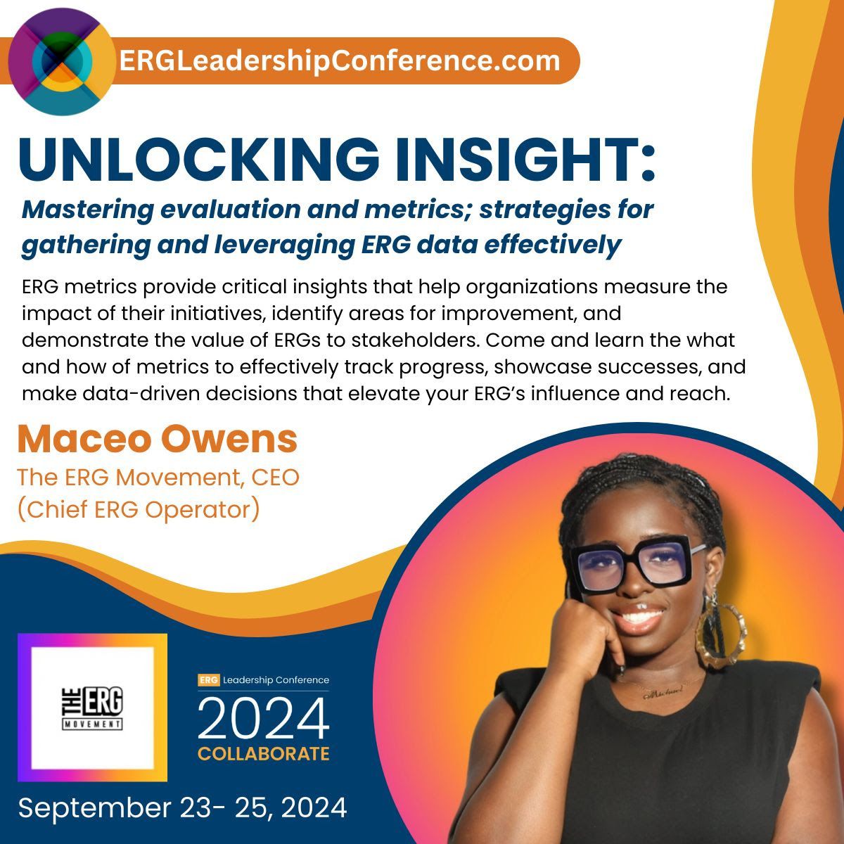
I will speaking at the ERG Leadership Conference in September and hosting a special event for conference attendees👀Grab your tickets ASAP
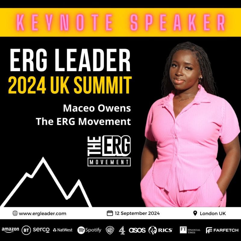
Looks like The ERG Movement is headed across the pond! I will also be speaking at the 2024 UK ERG Leader Summit ALSO in September! UK peeps - would LOVE to meet you there!
Also! Are you headed to AfroTech or BFUTUR this year? The ERG Movement will be hosting special ERG Programming at both! 🏆Reply to this email to let us know to send you the info when it’s ready!

In Case You Missed It…
Get caught up on the latest with The ERG Movement For starters, the latest episode of “Behind The Movement” out out now

That’s it for this week!🙌🏿
Weeks of consistent newsletters: 12🎊

